When thinking about my "favorite" website, I realized I go to the same social media sites everyday, none of them are actual websites that are interactive or produce anything more than "socializing" on the internet. However, when looking through my Facebook page, I realized I followed one particular website that I read from everyday, I just never noticed it was a website itself, because it's always on my news feed. The website I'll be analyzing is known as
Elite Daily, a website where freelance writers post about dating, relationships, school, and everything in between.
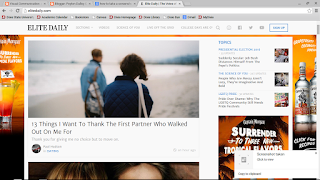
Looking at the website itself is very different from when I view it on my Samsung phone. Like Blogger, Elite Daily formats the articles on the PC screen to properly fit on my phone screen, however the ads aren't used in the background, but rather on the sides of the articles. The two pictures shown are what you seen when you come to the landing screen, the grind is devised into three groups that I can depict, the main bar which follows you down the screen; and one main column of recent articles, and a side column of other sub-stories (this includes trending topics). It's easy to navigate making it's intuitiveness useful, and the negative space between each story or ad makes it easy to see what is where.

It's theme is basic and clean- aside from the constantly changing ads. It's interesting to note though that the bottom right hand corner of the page is actually an ad, making for smart marketing. It's very interactive because anywhere you click, it will take you to an article or video clip. That's the whole point of this website is to get you to read certain articles. And it tailors to whatever I watch/read on Facebook as well, which is originally how I found the site, and starting using/sharing it.
Overall, the continuity and the affordance of the site is simply and easy to use on both my phone and computer. It's a site that intrigues me as a writer, and well as being good for my soul. Although there is negative space, the pictures are intriguing enough to where the site doesn't need any more noise. It's simply and easy to use, while being a good read for those interested in writings of "life" as I call it. Overall, it uses the axioms discussed in class in an efficient way.


 Looking at the website itself is very different from when I view it on my Samsung phone. Like Blogger, Elite Daily formats the articles on the PC screen to properly fit on my phone screen, however the ads aren't used in the background, but rather on the sides of the articles. The two pictures shown are what you seen when you come to the landing screen, the grind is devised into three groups that I can depict, the main bar which follows you down the screen; and one main column of recent articles, and a side column of other sub-stories (this includes trending topics). It's easy to navigate making it's intuitiveness useful, and the negative space between each story or ad makes it easy to see what is where.