Peyton Dalley COMM 3560
Tuesday, July 21, 2015
Monday, July 13, 2015
Mis-en-Scene
Wikipedia:
The film was co-written and directed by Baz Luhrmann, and stars Leonardo DiCaprio as the eponymous Jay Gatsby, with Tobey Maguire, Carey Mulligan, Joel Edgerton, and Elizabeth Debicki in supporting roles.[3] The film follows the life and times of millionaire Jay Gatsby and his neighbour Nick (Maguire), who recounts his encounter with Gatsby at the height of the Roaring Twenties.
The image of the party scene is what always fascinates me with Luhrmann's work, he knows how to throw a party, along with screenplay writer Craig Pearce. It's not only their highest grossing film, but also swept "Best Production Design" and "Best Costume Design" at the 86th Academy Awards. Catherine Martin designed the costuming for the show, she in fact took away the award herself. Coming from Australia, Martin also did the costuming for Moulin Rouge as well; she is also the wife of Baz Luhrmann.
Lurhmann wanted to throw a party, and have the cast to do so including Leonardo DiCaprio (whom he worked with in '96 in Romeo and Juliet), Cary Mulliigan, Toby Maguire (Spiderman), with Joel Edgerton. A well rounded cast with original music by Sia, Jack White, Fergie, Beyonce and many more. Taking a spin on the 20's in a modern way.
Wikipedia:
The Great Gatsby was planned to be filmed in the New York City area where the novel is set, starting in June 2011.[9] The director instead opted to shoot principal photography in Sydney. Filming began on September 5, 2011, at Fox Studios Australia and finished on December 22, 2011, with additional shots filmed in January 2012.[26][27] The film was shot with Red Epic digital cameras and Zeiss UltraPrime lenses.[28][29] Originally scheduled for a December 2012 release, on August 6, 2012, it was reported that the film was being moved to a summer 2013 release date.[30] In September 2012, this date was confirmed to be May 10, 2013. The film opened the 66th Cannes Film Festival on May 15, 2013,[31] shortly following its wide release in RealD 3D and 2D formats.
The clip above is of one of the major party scenes (and one of my personal favorite) in the movie, set design as well as costume design by Catherine Martin with Fergie singing it's a masterpiece. One thing Luhrmann does with is movies is add the hint of darkness to each of his movies, similarity to what I see in Tim Burton movie's, in fact I thought Tim Burton helped with this movie upon fist seeing it because their "darkness" is so alike. Personally what fascinates me the most with this scene is the cinematography, especially the costumes which I believe made the movie.
Overall, it's a very well done film and deserved the awards it's gotten. I love Baz Luhrmann films and thought this accentuated his career quite nicely, everything from the set to the scoring was done beautifully and I will continue to watch this movie over and over again.
Friday, July 10, 2015
Compose Your Frame
Wednesday, July 1, 2015
Axioms of Web Design
When thinking about my "favorite" website, I realized I go to the same social media sites everyday, none of them are actual websites that are interactive or produce anything more than "socializing" on the internet. However, when looking through my Facebook page, I realized I followed one particular website that I read from everyday, I just never noticed it was a website itself, because it's always on my news feed. The website I'll be analyzing is known as Elite Daily, a website where freelance writers post about dating, relationships, school, and everything in between.
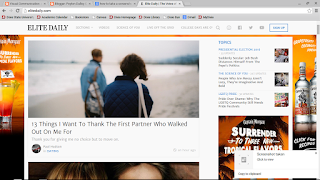 Looking at the website itself is very different from when I view it on my Samsung phone. Like Blogger, Elite Daily formats the articles on the PC screen to properly fit on my phone screen, however the ads aren't used in the background, but rather on the sides of the articles. The two pictures shown are what you seen when you come to the landing screen, the grind is devised into three groups that I can depict, the main bar which follows you down the screen; and one main column of recent articles, and a side column of other sub-stories (this includes trending topics). It's easy to navigate making it's intuitiveness useful, and the negative space between each story or ad makes it easy to see what is where.
It's theme is basic and clean- aside from the constantly changing ads. It's interesting to note though that the bottom right hand corner of the page is actually an ad, making for smart marketing. It's very interactive because anywhere you click, it will take you to an article or video clip. That's the whole point of this website is to get you to read certain articles. And it tailors to whatever I watch/read on Facebook as well, which is originally how I found the site, and starting using/sharing it.
Overall, the continuity and the affordance of the site is simply and easy to use on both my phone and computer. It's a site that intrigues me as a writer, and well as being good for my soul. Although there is negative space, the pictures are intriguing enough to where the site doesn't need any more noise. It's simply and easy to use, while being a good read for those interested in writings of "life" as I call it. Overall, it uses the axioms discussed in class in an efficient way.
Tuesday, June 16, 2015
Design Evaluation: Good vs. Bad
One thing that I thoroughly enjoy is musicals, it's something that I love to not only take part in, but also watch as well. However, when deciding to see or show or not one of the first things I notice is the poster or Playbill presented when watching the show. This determines the first impression of the show, as well as being able to capture an element of the show that captures an audience as well.
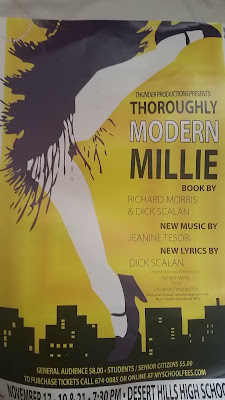 Bad: Excuse not only the bad quality of this photo, but also the design itself. Yes, this was a poster for a show I did in high school. Let me also express how much I "thoroughly" don't enjoy this design layout one bit. To start, when they first presented this to the cast members I actually complained to the director of what a shit job the designing students did. Look at that, it doesn't even look clean! Color scheme of this poster didn't flow one bit, nothing is clean at all -which is probably my biggest problem with it. Lines and structure were completely thrown out (that shoe bugs), not to mention the proportions of this aren't even in line either (top shoe is cut off). When I looked at this I didn't think this show is about the 1920s, but rather why aren't the legs smoothed out, and is that a dress? Sure, the poster is beneficial when wondering about information, but did you really want to see the show? There is no closure, nothing makes sense, it's like the poster cannot find an even ground, when is it suppose to come together? Awful color choice, not once did we use anything purple and yellow either - so that was false advertising. I'm actually okay with the font of the piece, just not the color. Should have stayed with one color-a complimentary color at that, not black and white on yellow (makes me think of a bumblebee, another thing that wasn't in the show).
Our competition that year was Les Mesierables -and they used the original Broadway design, so of course they sold out and we didn't . Our show was actually pretty good too-the poster didn't capture that.
This was the original Broadway design for Thoroughly Modern Millie.
Even with the white-on-white clash I STILL would have preferred this poster to be shown, simply because of the font alone. It was more inviting and simplistic than all those crazy clashing colors.
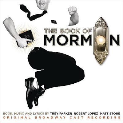 Good: Ahh so much relief in one picture, I cannot even contain my excitement about this poster- as I may have bought a giant replica of this poster when I saw this glorious musical last winter. I love the design of this poster, almost as much as the show itself. The simplistic black and white just make sense in this scenario especially since Mormon missionaries are most often seen in only those two colors. The simplistic chic design works for this poster -with not much going on it's easily to interpret what the musical is about. Although the top of Andrew Rannels head is cut off I wouldn't throw out this design because it is still in proportion and symmetrical. The doorbell is not only a symbol for the show and the culture, but very clever in the wording as well. Also notice the font on the word "Mormon" is almost identical to the font of the English Book of Mormon. These guys did their research. It's also a symbol not only for the musical but the culture, people all over recognize the religion and show because of this poster. Very modern design with elements that make this poster clever and recognizable. I would see this show over and over again if I could.
 Bad: Excuse not only the bad quality of this photo, but also the design itself. Yes, this was a poster for a show I did in high school. Let me also express how much I "thoroughly" don't enjoy this design layout one bit. To start, when they first presented this to the cast members I actually complained to the director of what a shit job the designing students did. Look at that, it doesn't even look clean! Color scheme of this poster didn't flow one bit, nothing is clean at all -which is probably my biggest problem with it. Lines and structure were completely thrown out (that shoe bugs), not to mention the proportions of this aren't even in line either (top shoe is cut off). When I looked at this I didn't think this show is about the 1920s, but rather why aren't the legs smoothed out, and is that a dress? Sure, the poster is beneficial when wondering about information, but did you really want to see the show? There is no closure, nothing makes sense, it's like the poster cannot find an even ground, when is it suppose to come together? Awful color choice, not once did we use anything purple and yellow either - so that was false advertising. I'm actually okay with the font of the piece, just not the color. Should have stayed with one color-a complimentary color at that, not black and white on yellow (makes me think of a bumblebee, another thing that wasn't in the show).
Our competition that year was Les Mesierables -and they used the original Broadway design, so of course they sold out and we didn't . Our show was actually pretty good too-the poster didn't capture that.
This was the original Broadway design for Thoroughly Modern Millie.
Even with the white-on-white clash I STILL would have preferred this poster to be shown, simply because of the font alone. It was more inviting and simplistic than all those crazy clashing colors.
 Good: Ahh so much relief in one picture, I cannot even contain my excitement about this poster- as I may have bought a giant replica of this poster when I saw this glorious musical last winter. I love the design of this poster, almost as much as the show itself. The simplistic black and white just make sense in this scenario especially since Mormon missionaries are most often seen in only those two colors. The simplistic chic design works for this poster -with not much going on it's easily to interpret what the musical is about. Although the top of Andrew Rannels head is cut off I wouldn't throw out this design because it is still in proportion and symmetrical. The doorbell is not only a symbol for the show and the culture, but very clever in the wording as well. Also notice the font on the word "Mormon" is almost identical to the font of the English Book of Mormon. These guys did their research. It's also a symbol not only for the musical but the culture, people all over recognize the religion and show because of this poster. Very modern design with elements that make this poster clever and recognizable. I would see this show over and over again if I could.
Thursday, June 11, 2015
Contrast, Balance, and Harmony
Over the years i've found a niche I love to do when exploring a city, state, or unknown area and that's look at the buildings and architecture associated with the place. However, I am not a photographer and cannot capture what I plan in my head, so i've often turned to the next best thing- Pinterest. I often explore the world of architecture and life through the lens of Pinterest, inspiring me not only to seek these places, but also finding out what images and places bring me "peace". This is one of those images.
This image is very inviting to me, the camera angle makes it appear that i'm going to burst out of the window almost, calling me for the adventure that's ahead (I also have a niche for the ocean). When analyzing it with the elements of contrast the colors in this image or not only inviting, but also have a soft feel to them. This could be why this image is also so peaceful to me, with lighter shades of blue, grey, green, and off shades of white this image fills the space up with it's inviting message to wonder (or at least to me).
This image is perfectly balanced when it comes to the rule of thirds in photography, but it's also balanced with its aroma of peace. It makes me want to stare out of the window and let the sea take me where I need to be. As explained in class, balance is easily identified but most of the time we don't know why. For me it's probably the nature of the picture, if I could be anywhere it would be near the ocean, I associate good things, thoughts, and experiences with the ocean. That could be a major factor why it's so balanced to me, it brings back my balance in life.
Leading into the last element -harmony. Likewise with balance; harmony also gives me that sense of peace that I associate the ocean with. When looking at this picture I can hear the harmonic sounds of the ocean, and how everything falls into place, it's the icing on the cake. From the highlights and colors of the picture, to how it's shaped because of the angle of the camera, it all comes together as this harmonic form that I desperately want to run away too.
Wednesday, June 10, 2015
Subscribe to:
Comments (Atom)


