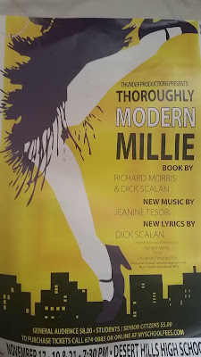
 Bad: Excuse not only the bad quality of this photo, but also the design itself. Yes, this was a poster for a show I did in high school. Let me also express how much I "thoroughly" don't enjoy this design layout one bit. To start, when they first presented this to the cast members I actually complained to the director of what a shit job the designing students did. Look at that, it doesn't even look clean! Color scheme of this poster didn't flow one bit, nothing is clean at all -which is probably my biggest problem with it. Lines and structure were completely thrown out (that shoe bugs), not to mention the proportions of this aren't even in line either (top shoe is cut off). When I looked at this I didn't think this show is about the 1920s, but rather why aren't the legs smoothed out, and is that a dress? Sure, the poster is beneficial when wondering about information, but did you really want to see the show? There is no closure, nothing makes sense, it's like the poster cannot find an even ground, when is it suppose to come together? Awful color choice, not once did we use anything purple and yellow either - so that was false advertising. I'm actually okay with the font of the piece, just not the color. Should have stayed with one color-a complimentary color at that, not black and white on yellow (makes me think of a bumblebee, another thing that wasn't in the show).
Our competition that year was Les Mesierables -and they used the original Broadway design, so of course they sold out and we didn't . Our show was actually pretty good too-the poster didn't capture that.
This was the original Broadway design for Thoroughly Modern Millie.
Even with the white-on-white clash I STILL would have preferred this poster to be shown, simply because of the font alone. It was more inviting and simplistic than all those crazy clashing colors.
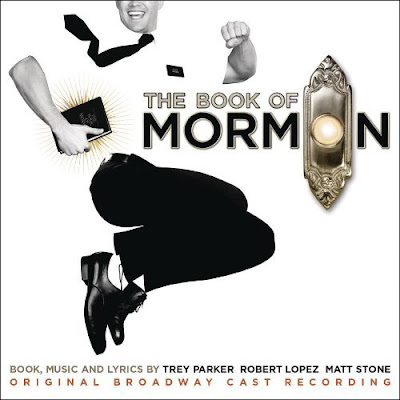
 Good: Ahh so much relief in one picture, I cannot even contain my excitement about this poster- as I may have bought a giant replica of this poster when I saw this glorious musical last winter. I love the design of this poster, almost as much as the show itself. The simplistic black and white just make sense in this scenario especially since Mormon missionaries are most often seen in only those two colors. The simplistic chic design works for this poster -with not much going on it's easily to interpret what the musical is about. Although the top of Andrew Rannels head is cut off I wouldn't throw out this design because it is still in proportion and symmetrical. The doorbell is not only a symbol for the show and the culture, but very clever in the wording as well. Also notice the font on the word "Mormon" is almost identical to the font of the English Book of Mormon. These guys did their research. It's also a symbol not only for the musical but the culture, people all over recognize the religion and show because of this poster. Very modern design with elements that make this poster clever and recognizable. I would see this show over and over again if I could.


